About asura1234

I'm awesome.

Week 1 Reading Notes and Reflections

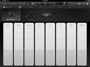
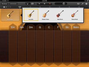
This blog post is a make-up blog post for the reading of first week on the book design of everyday things: Donald A. Norman. I was so inspired by this book that I started looking for usability issues in everyday object like my shower knob and elevator. It broadens the knowledge of Human Computer Interaction to interaction design of all man made objects. The principles for design computer software interfaces in fact are not so different than the interface of a microwave, kitchen stove, or elevator. In fact computer interface has drawn inspiration from buttons, knobs, and switches, which are industrial age inventions. The usability principles remain the same even though things have gone digital for the last decade. On the other hand, we can also see that computers are made to be small in size and portable. Take my car for an example, it has a computer built inside for the radio, CD, bluetooth and navigation system. But we perceive as we are interacting with the car not a computer. So I think there is a no boundary as in how far this knowledge can go. It only matters where I want to use it.

The area I’m particular interested in is the interaction design of games. Games are differentiated from animated movies because of the involvement of interaction. But people don’t seem to notice the importance of that. There are already many well-defined genre of games. Each offers its own pre-defined interaction experience. But people including the players or the developers don’t really take this seriously, because at the end of the day “it’s just a game”. That’s why we see some game companies hire interns to do interface design and leave the more code heavy work to engineers, and art heavy work to artists. It’s almost as identical as the situation with software industry years ago, when big software companies were doing the same thing.

As was shown in my example of Dead Space, good interaction design can indeed transcend the game. And I sincerely hope that I will be able to use the knowledge learned from this class to accomplish that in my future career in the field of game development.

Dylan

UI Design Example: Screen Shot Utility Function of QQ

Tencent_QQ

For those of you who are not familiar with QQ. QQ is a Chinese mock up of ICQ, an online chatting software. It’s been in the market for more than a decade. A lot of people criticizing the company for not being innovative, but with tens of millions of active users, QQ’s first place position in social networking market in China is just unshakable.

Enough about the company and the software, let’f focus on our topic for this blog post the screen shot taking utility that’s offered in QQ. Taking screen shots has always been a pain for many us. As students, we are expected to make a tons of presentations, and write tons of papers. So we experience taking screen shots a lot. The most annoying part of taking screen shots is that most times there is an additional step of editing the screen shots between taking them and pasting them. By editing, I mean cropping the images to only included the intended content. I’m surprised that this is not a built-in feature for Windows PC. In windows PC, there is a screen shot key on every keyboard for taking screen shots. But however, by pressing the key, you are taking the entire screen. There is no options for taking a screen shot of a specific window or a certain area on the screen. For mac users, there is a hot key for taking the entire screen (command + shift + 3) and a a hot key for taking a square area of the screen ( command + shift + 4). Even though the features are their, it’s just impossible to crop the screen shot in pixel level to avoid the unwanted edges. And there is no option for directly pasting the screen shots to text processing softwares or documents on the internet. All screenshots are saved automatically on the desktop, which can be very annoying.

QQ’s screen shot taking interface has offered a perfect solution for solving this problem once and for all.

QQ20121209-5

The first noticeable difference of QQ’s screenshot taking utility and Mac’s built-in utility is that QQ shows a box of magnified view of the mouse location, and in the box there is a cross hair for accurate positioning. Therefore, with a little bit patience, it’s possible to get the screen shot right the first time without further editing it.

Screen Shot 2012-12-09 at 10.14.44 PM

The second important feature is that with QQ’s screenshot taking utility, taking screenshot of a window is super easy. You just need to move your mouse over the window that you want to take screenshot, and all the area outside that window will be darkened to indicate that you are only taking screenshot of the lighted area.

QQ20121209-6

The third important feature is that after you’ve done cropping the screenshot to the way you like, you can still have the option of adjusting it by moving the nodes before everything is final.  When you are adjusting the nodes the box of magnified area will show up again to make sure everything is absolutely perfect.

QQ20121209-1

And the buttons on the right gives you the option of adding colored boxes, circles, arrows, brush strokes, or text on the existing screenshot. And after you’ve accomplished all your goals, you have the option to cancel, save it to clipboard for directly pasting it to other files, or save it to file.

I think this is very good example of good user interface of solving a troublesome problem that’s been here since the dawn of GUI. I really wish this design can be system wise available for all PCs and Macs. Or it will be kind of silly just to open up your online chatting software for the sake of taking screenshots.

Dylan

Breakthrough Ideas: Face as controller.

I remember when I first saw the E3 presentation, I was so impressed with the idea of using human body as controller. Years later, I thought to myself what about using human face as a controller to control viewing. Therefore I did an undergraduate research in trying to use face tracking data to control viewing panoramic images in real time. Because of the instability of the face tracker that was used in my research, the result wasn’t really promising. So I didn’t end up publishing any paper on this. Then in the same year, I came across FaceAPI, which is the link down below. They basically did the same thing but with much more success than I did.

I think incorporating face tracking data into controlling computers can bring so many changes to interface design. We can adjust the images shown on computer monitor according to the head movements of the users, which would allow more information to be shown without changing the size of the screen (i.e. when the user look left, we can show one the left part of the desktop, and when the user look right we can just show the right part of the desktop).  The amazing part of this is that this doesn’t not even require special hardware. Both in my research and FaceAPI, the only additional equipment needed is a web camera, which is already available in most laptop computers and computer monitors.

However, the big challenge is calibration of control. The dilemma is that small movements of the face are hard to track and large movements are counter-intutive given that the user is looking at a screen close to him or her. Given the limitation of  accuracy and robustness of current face tracking algorithm, reaching the perfect calibration of control is almost impossible. Because we’re dealing with interaction here, a tiny bit of delay or mis mach would cause a lot of confusion for users. I think we still need to be cautious in experimenting with this. But I hope that there will be future advances in this area.

Dylan

Thoughts On The Presentations For UR4

I think everyone’s done an incredible job on the presentation for UR4. Every group stayed in the time limit and offered a great insight of what they’ve done with the assignments.

I’m seriously impressed with some of the new ideas that some of the group had in their usability testing. Some group mentioned that they recorded the number of clicks and the path participants took to find what they believe is the correct information. We’ve thought about doing that, but we didn’t want to go through the trouble of having to watch the screen capture video to get that information. It’s nice to know that there are some software out there that does that. And one group came up with the idea of “error”. Although it was still not clear to me how they define it. But I can see their effort in trying to explain and analyze their observation.

Our group on the other hand took an rather academic approach. We did tons of research of what’s out there on the internet and tried to find the safest and most reliable way to do so. One may say that we’re being lazy. But that means you’re calling the thousands of people who used the same method before us are lazy too. We as a group are proud of what we threw together as a team in the time given. And I’m so proud of all the group members for putting so much effort into it until the very last moment.

Dylan

UI Design Good Example: Smart Instrument for Garage Band on iOS

This time we’re gonna talk about another phenomenal Apple Product Garage Band. I had this app right after it came out and it absolutely blew my mind away, mostly because of the innovative user interface design of what they called Smart Instruments.

I know for a fact for a lot of people, being able to play an instrument has always been their dream since they were a child. To be able to play at a level that your music can be appreciated by others is not easy to achieve. It takes tons of practice. I remember when I was child, I played trumpet. And for the first few weeks, I couldn’t hit any note correctly so the sound coming out of my trumpet sounds more like animal roaring than any form of music. It took me years of practice to finally got to the point that people praise my performance not because they don’t want to hurt my feelings. However, most people don’t want to spend much time and effort to achieve that, and they typically don’t care about being able to play all kinds of music. Some people say that they will be pretty satisfied if they are able to play just one song. Because of this demand, many companies tried to use modern technology to simulate the experience of playing instrument. But there is balance of how realistic that experience is and how easy it is for people who are not familiar with the instrument. On one end we have Guitar Hero that you are just hitting the correct button at the correct timing. On the other end of the scale we have those piano simulators, that you have to play it like you play a real piano. I think the Smart Instrument in Garage Band for iPad falls right in the middle, and has achieved the perfect balance among all.

garage-band-grand-pianoLet first take a look at the Smart Piano. First of all, this interface shares many similarity to an actual piano with keys to generate sounds. But if you take a closer look the keys for Smart Piano are not for a single note but instead for chord. This can go back to my previous discussion about some people only wishes to play songs. In songs, piano are mostly for musical accompaniment not for melodies. So this design suffices for playing sounds. On the other hand there are less number of chords for songs than for notes. For popular music, generally speaking a song will only have 4 to 8 chords. So this design largely reduced the complexity of playing piano by reducing the number of keys to just 8. However, the user still has control over the combination of chords. So they still have the freedom to play any songs that they want. The other thing that hinders people’s ability to play piano is that even after you get the chords right, you still need rhythm. And here they offer 4 built-in ones that should cover most music genre, so the only thing that you need to worry about is changing chords as the song goes on.

garage-band-guitar-picker

We can see a similar design for Smart Guitar.

Overall I think Garage Band has done a phenomenal job of lowering the difficulty of playing instruments but still offers an infinite set of songs that you can play. I really enjoyed playing with it. I hope you like it as well.

Dylan

UI Design Bad Example: Sins of the New Youtube Layout

Just a few days ago, Youtube changed its layout. Many people’s reactions to are “What happened” “Why everything looks different?” “Where did the old video page go?”. I’ve had my experience with the new layout for a little bit. I think now it’s time to make my comments on why I think the new layout “sucks”.

First let’s exam why Youtube changed its layout in the first place. Youtube did this for making their sites more compatible across mobile platforms. Starting with the first generation iPhone, people are using their phone, and tablet more for browsing the internet.   This is because mobile devices are easy to carry around, and you can open and start using them instantly instead of having to go through the trouble of reaching your laptop from you bag and waiting for it to boost up. The problem with mobile devices is that they all have drastically different screen resolution and width to height ratio. Making a separate app for every platform is an insane amount of work. So Youtube decided to just change its home page layout and make it compatible for all platforms. This decision is made from an engineering perspective, meaning using new technology to technical problems, not from a usability perspective. This is often time where usability issues starting to arise.

The first and worst sins of Youtube is its white background. I think we can draw inspiration of this video talking about why using black text on white background for presentation is a “no”.

The video compares black text on white background for presentation to looking at a light bulb when it’s on. I’m gonna compare using a white background for a video streaming site to having all the lights on while playing movies in a movie theater. You have all the lights shooting at you with its full power, so it’s not relaxing at all. People get tired really easy.

The second sin of the new Youtube layout is the white space on the right of the screen. I criticized one of the presentation for UR4 for noting using the full screen. This is the same case here. It’s totally fine with me if Youtube wants to fit more stuff in the screen of mobile devices, but it’s not OK to let us PC users suffer from that. I think at least they should have the curtesy of making everything centered, and having two side bars on each side.

As for viewing videos, youtube decided to change it back to the way it was recently. So I’m not gonna further comment on that.

In the end, I wish when people integrate new technology to their product, they can think from the user’s perspective. It’s not always about staying on top of the newest technology. People love youtube for the content that’s on there, for the freedom to show off whatever they want, not for the technology. I sincerely hope that youtube can realize that. Otherwise, they may just drive people away to a different social platform.

Dylan

Thoughts on the CGT 512 Human Factors of Computer Interface Design

As the semester is coming to an end, now is a great time to exam how I benefit from this course and how can changes benefit future students studying this course.

This course is heavily focused on learning through assignments. The lectures for the most part is either an open discussion of the readings, or a small group in-class group project. I absolutely love having class this way, because I believe at the end of the day it’s not much about what we know, but what we can do with what we know. So in the following paragraphs, I divide in to different kinds of assignments and talk about how I feel about them.

First let’s talk about Research Article Analysis (RAA). Now it is very clear to me that as graduate students, we must be able to read research articles. That’s why courses like CGT 501 and CGT 511 are drilling us to do all the time. However, I don’t see how research articles play an important role in this course. I’m always having trouble finding research articles that I’m interested in. It’s really hard for me to find articles that are closely related to the materials that we learn in this course. I can think of two reasons for that. One is that the methods that we learned in this course are already established years ago, and it’s hard to find articles that are that old. The second one is that the methods and principles that we learned from this course are rarely originated from scholarly research. They are mostly based on experiences and experiments of UX practitioners such as authors of our text books. I managed to find 2 that are related to UR 4 about post-test questionnaires, and that’s it. And 5 total articles are a lot. I would like to see changes on this in the future.

Robyn-vs-Kimmie

Next let’s talk about Usability Reports (UR). I think having people forming teams doing this is great. It’s a great opportunity to learn not only from the assignments but also our classmates. But I really don’t understand all the intervention that Dr.V put into forming teams. First is the restriction of working with people that you haven’t worked with. And from UR 3 and 4, teams are assigned by Dr.V. I think building dynamics of a team takes time for everyone in the team to buy in. And only when you already get a strong and stable team, can you handle this amount of pressure coming from assignments like UR 3 and 4. We see teams in reality shows collapse all the time, because they are a bunch of strangers randomly put together, and everyone is for themselves. All this fighting and drama in reality shows are not because these people are all bad in nature or the show is scripted. It’s because a lot of things are on the line, and people just have a hard time trusting other people. I think giving people the freedom to choose for themselves definitely helps with this. And I would also recommend especially for UR 3 and UR 4 to have people pitching their ideas in front the class, and have other people choose which team they want to join. I think it’s really really really helpful for people to have something that they all agree on before they start working together. It’s my nightmare to come to a team meeting to have 4 people with 4 drastically different ideas. And my nightmare just gets even worse, when you see one person with multiple drastically different ideas. For people who have worked with me, you may know that I always work more comfortably with my idea. It’s not a matter of “mine is always the best”, but style. I don’t think I’m the only case in this matter. For example, although the groups for the two presentations were changed, you see some styles remained. Some people may be offended by other people’s style, so I think it’s important for people to be able to choose whether they want to be part of it or not.

Blog assignments are a great way of provoking thinking of the things that we’ve learned from this course. I love the idea of having the instructor hand pick the best of the week so we won’t need to follow through all the blogs. But I think there are too many of them. It’s so difficult to have an opinion or an interesting thought on every single thing. And what Dr. V described as “engaging the materials” is just me being lazy. It’s much easier to lead people believe that you’ve put thoughts into something when you opt to argue against it. On the other hand, you don’t have much to say besides repeating and summarizing things if you choose to agree with it. I heard some people get points off for doing that. I feel terribly guilty for not suffering the same punishment. However, if we all deserve to be punished, then it can only be that there is something with the rules. I’ve been following some of the blogs because of this course. And I don’t see them, posting in the speed that we do in our course. If we spread out the posts, it’s like two posts per week. This is kind of insane.

Dylan

UI Design Example: iPhone Messages App

It may seem to you guys that I’m a huge Apple lover and Microsoft hater because of the comments I made on Windows 8. But I was just being honest with my opinions. Apple isn’t always perfect in the aspect of usability as I showed in the example of iTunes. Now it’s time to take a look at another revolutionary invention that Apple brought forth – iPhone Messages App.

more_messages_image_2x

The biggest innovation of this design is that it makes texting more “conversational”. Before we move on, I want to point out to you that this design is not that revolutionary or ground breaking as Apple boasted. This design mimics the design of early instant messaging softwares such as ICQ, MSN, etc. Instead of sending messages and replies back and forth, this design provides a context for users for what were they discussing earlier. This is useful because of the principle of “recognize instead of recall”. Users won’t lose track of what they were in the conversation anymore. This definitely works really well for online chatting, that’s why we see most social platform adopting this. But I can’t say for sure that this works also for texting. And here are my reasons.

First of all, texting is a much more expensive way of communication than sending instant messages online. So no matter what kinds of data plan (fixed number of text, unlimited text, charge per text) that you have for your phone, generally you would want to keep track of how many texts that you’ve send on a monthly basis. This is very different to emails or instant messages where you can send as many or as less as you want without worrying about anything. However, for texting, if you have a data plan for 600 text per month, and you normally don’t reach that number every month, you may want to look into your data plan to see if you can get less texts per month. On the other hand, if you always go above that number of 600, you may want to raise the number of texts for your data plan. Apple’s Messages App for iPhone is failing on this aspects. There is no easy way to count the number of texts in this App. Moreover, there are also messages with pictures, and also “free” messages sent through apple servers. There is really no easy way to have control over the money you spend on texting for users.

Second of all, the design of this App didn’t take mass text into consideration. There was one time, that I got a mass text from a friend, and my reply to this text ended up sending to everyone who received this mass text. I think the problem is that they messed up in chatting with multiple people feature. The app recognized this mass text as a conversation between multiple people. If it were conventional text application, there wouldn’t be such problem.

In the end, my opinion towards this design is neutral. I like the search feature clearly displayed on the top menu bar. I think Apple is being too aggressive and moving too fast with the changes in the cell phone industry. They are still fighting over matters of the sims card, GSM vs CDMA, etc. Cell phone carriers used to think they are sitting on a gold mine after they set up their signal towers. Now here is Apple jumping in telling them what to do. So they are resilient to these changes. I think for a change to be successful, we need everyone to stay on one page.

Dylan

Qualitative Research Versus Quantitative Research

Differences between qualitative research and quantitative research:

Purpose: To understand & interpret social interactions (Qual) To test hypotheses, look at cause & effect, & make predictions (Quan)

Sample selection:  Smaller & not randomly selected (Qual) Larger & randomly selected (Quan)

Scientific Method: Exploratory or bottom-up: researcher generates a new hypothesis and theory from the data collected (Qual) Confirmatory or top-down: the researcher tests the hypothesis and theory with the data (Quan)

Results:  Particular or specialized findings that is less generalizable (Qual) Generalizable findings that can be applied to other populations.

More details can be found in here.

I think these two methods are both solid way of doing research. They both have their merits and limitations. Sometimes the choice comes down to the resources that you have and your research intention. If I don’t have a the ability to recruit more than 10 people to participate, quantitative research is obviously not the optimal choice to my situation. And if I want to prove the assumption that college students prefer pepsi over coke, qualitative research can’t be a reliable resources for that. And if I want to find out what’s favorite choice of beverage for college students and why they like it, the two can play together seamlessly.

Dylan

UI Design Example: Study of Shower Knobs

In the spirit of taking usability analysis to everyday object. I’ve long decided to do a blog post on show knobs. The designs of shower knobs are very versatile. They have all different  shapes thus provide different affordances. But for the most of time, the affordances aren’t very clear. A shower knob can afford twisting, pushing, or pulling. Things become really confusing, when the design requires not only one but two or three of these action together to work. Just by the look of them, you can never tell how it works. This inconsistency across different design of shower knobs has resulted people forming multiple mental models in their head. They are forced to experiment with it, and figure out which mental model fits the product. Here are some examples of confusing examples of shower knobs.

This design is very common. The knob clearly indicates that you need to twist it. What’s problematic is the red and blue stickers. The picture shows one of many examples. The problem with this example is it implicates that you can’t adjust the temperature of the water , that you can either go “hot” or “cold”, where in reality you may be able to adjust the temperature by twisting it to different degrees. Another example is putting in a gradient red to blue semi-circle sticker, or two semi circles with the gradient of red on one side and blue on the other side, to the chrome plate behind the knob. The problem with this method is that, since there is no arrow pointing on the knob, you can never tell what level of temperature you are right now. The worst design of this kind is to add push pull feature to the knob, it’s complete madness. I won’t even go that far.

Another popular design of shower knob is this handle shape knob. The handle shape indicated you can pull it. And the handle pointing to the red and blue sticker on the chrome plate will also indicate the temperature of the water. However there is difference among designs on the limits of twisting. Some designs allow you to go from horizontal left to right, where neutral sits between. Some designs allow you go go from vertical down to up, or the other way around. This gets very confusing sometime, if you get used to one of these and expect all shower knobs to work that way. The worst case with this is that you can’t pull the handle, which is completely contrary to its affordance. The shower knob in my apartment right now is like this, so it took me a lot of time to get used to.

You may want to ask why I’m super interested in shower knobs. This is because people tend to feel insecure, and sometimes cold when they are naked in the shower. You just want that hot water to run down from the shower head as soon as possible. When that doesn’t happen because you can’t figure out how the knob works, it gets more annoying than something on your computer stops working.